The French Liaison Magazine
Editorial Design
Tools
Adobe InDesign
Procreate
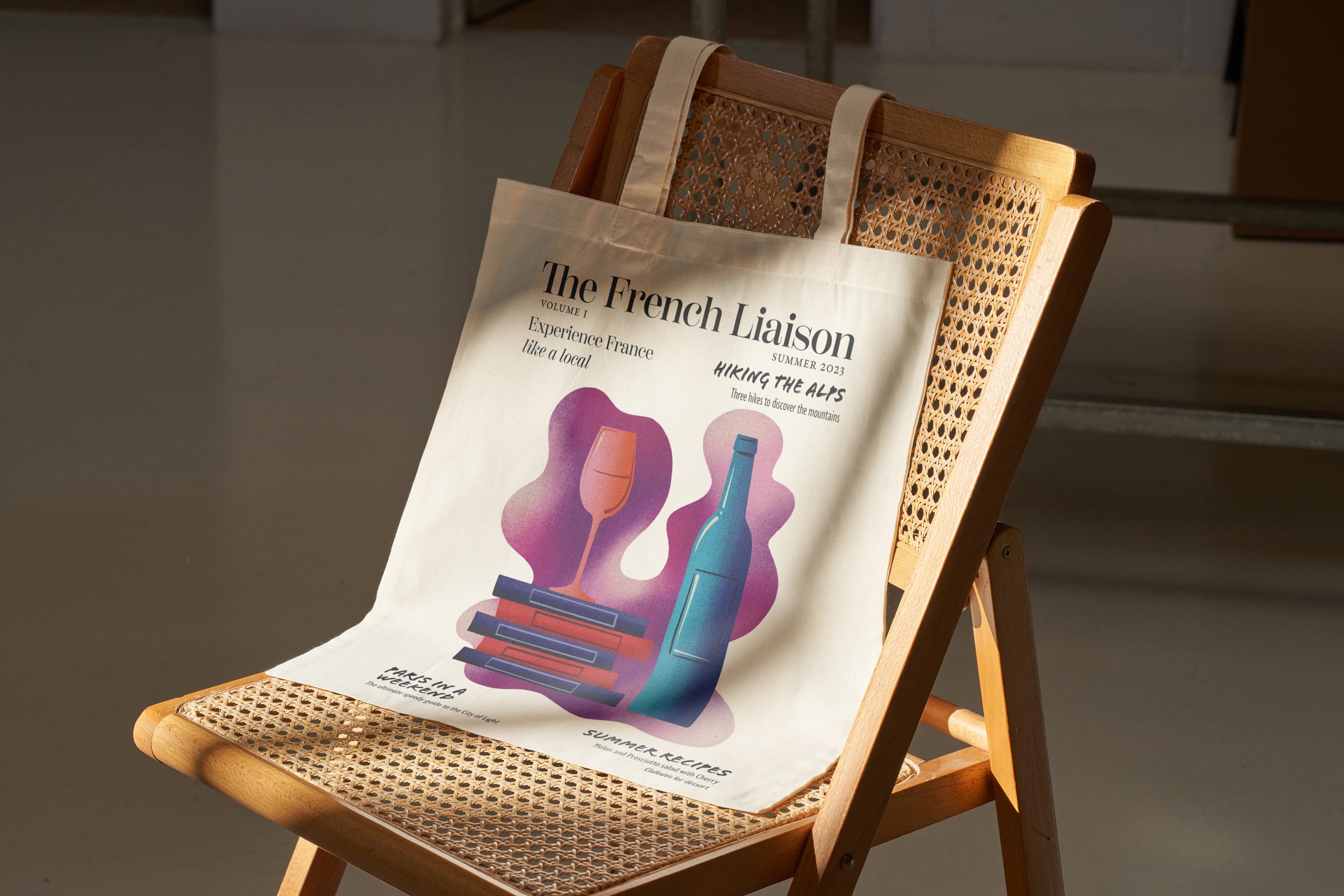
The French Liaison Magazine invites you to experience France like a local. The challenge was to create a magazine in InDesign and then expand it to a cohesive brand. This design is a paired back and flexible solution: restrained in its use of color, allowing for the typography to take center stage. The magazine invites the viewer to leaf through and find an adventure off the beaten path. Its minimalist branding is refined while still retaining a warmth of tone through articles that maintain a personable voice.
Illustration & Typography
I started with research, studying magazine layouts and articles. The masthead was the first design challenge and Scotch Display offered a wonderful serif solution that included a ligature from the "T" to the "H". This was perfect for the name of the magazine that literally makes reference to the french language equivalent of a phonetic ligature.
The original illustration for the cover was designed in Procreate to evoke a summer day at a Parisian cafe. The design of the cover balances whimsy with elegance. The bright illustration on the cover draws in the viewer but keeps a focus on typography with its use of black and white.


Interior Spreads & Fall Edition
The interior spreads feature a pared back and clean aesthetic. The hiking articles offer an inviting entry through the use of a breathtaking image of an ibex for a splash page. The "Paris in a Weekend" article uses metro line imagery for a fun take on a bulleted list. Finally, the pops of summertime color in the cooking section offers a little brightness to the magazine.
The fall magazine allows for an expansion on the brand but with a consistency in cover layout and maintaining a focus on strong typography. I wanted to evoke the sensory nature of autumn and really invite the reader in. I found an amazing photo of a special apple pie called “Tarte Tatin” and edited the top to allow for the masthead text to be very readable. The brand balances elegance with a familiarity that invites the reader in to explore France through its pages.
Web Page
When approaching the challenge of translating The French Liaison magazine to the web, I focused on organizing the information clearly for the user and carefully selecting typography for hierarchy. I used a hero image on the landing page to draw the viewer in and a button that calls them to action immediately. The traditional comfort of Garamond is balanced with the clear geometry of Arial across the layout. Gelica offered a funky mix that shakes up those safer typefaces for higher impact on top of the hero image.
I chose to keep the color palette restrained and only utilize light blue for the article categories and a light yellow for the text on top of the hero image. These traditional french colors in low saturation evoke travel to France without being too crass. The articles are arranged on a grid for structure that is easy to navigate, while also having variety in layout to maintain interest.


Email Marketing
The marketing email retains the core elements of the website, with a couple of adjustments for visual interest and to prompt users to action. The email retains the hero image and tagline of the landing page, but as a smaller section so that you can see the start of the featured articles when you open the email.
I created two sections that market the brand merchandise and bring attention to current sales. A band of gray unifies the featured articles and a band of yellow brings user attention to the discounted merch. This visual variety of color and layout within the grid makes for a pleasant scrolling experience, while bringing attention to the deals interspersed between articles.
Logo and Merchandise
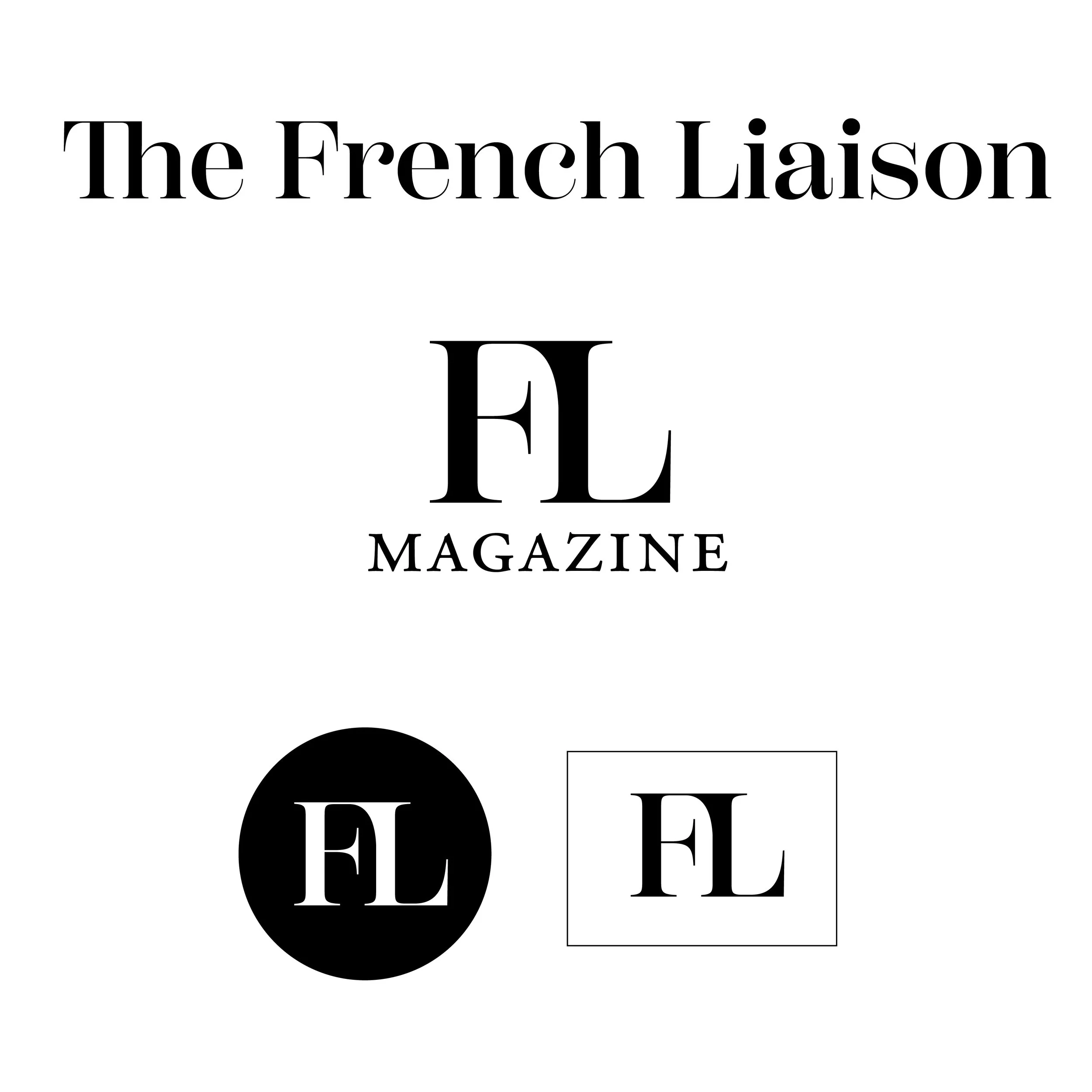
The logo is reduced to its typographical essentials: an F and an L that have been adjusted in Illustrator to form a ligature. This is a direct visual nod to the magazine name and “la liaison” in french speaking patterns. The logo is restrained and refined, and translates effortlessly to a carefully curated wardrobe of young travelers.
Keeping the color palette of the brand restrained means that classy black and white merchandise can shine. The monogram nature of the “FL” can allow it to rise to instant recognizability and association with a classy travel mag.