East of Eden
Book Design
Tools
Adobe Photoshop
Adobe InDesign
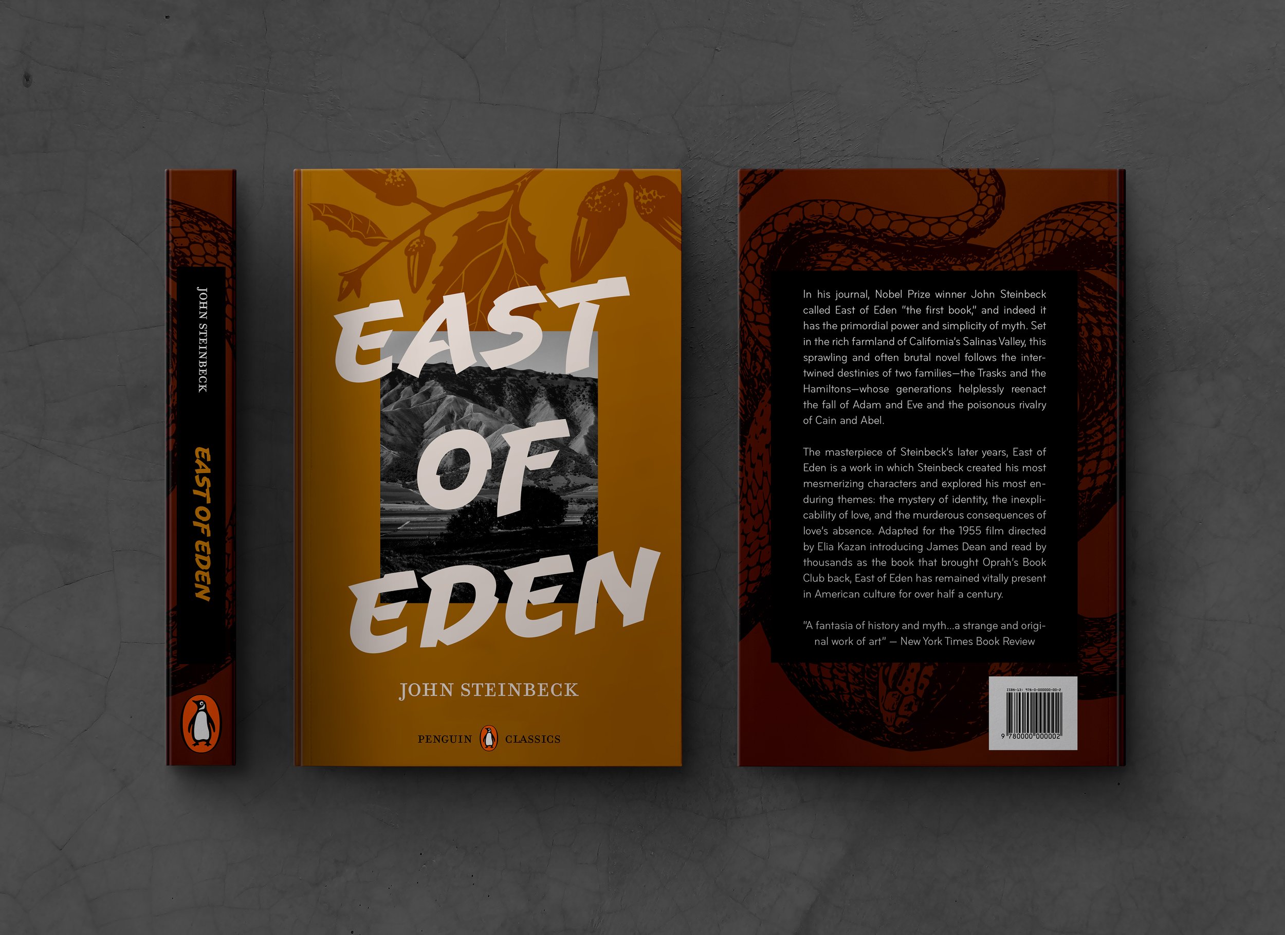
East of Eden is a novel by Steinbeck that I read while living in the Salinas Valley, the setting for this masterful book. The editions that exist for East of Eden are safe in their cover design and too pleasant at times. I wanted to create a cover that captures the expansiveness of this book through complex family webs, dusty Americana and allegories to biblical stories. Most important was to keep the epic firmly rooted in the oak groves and dusty hills of the Salinas Valley.
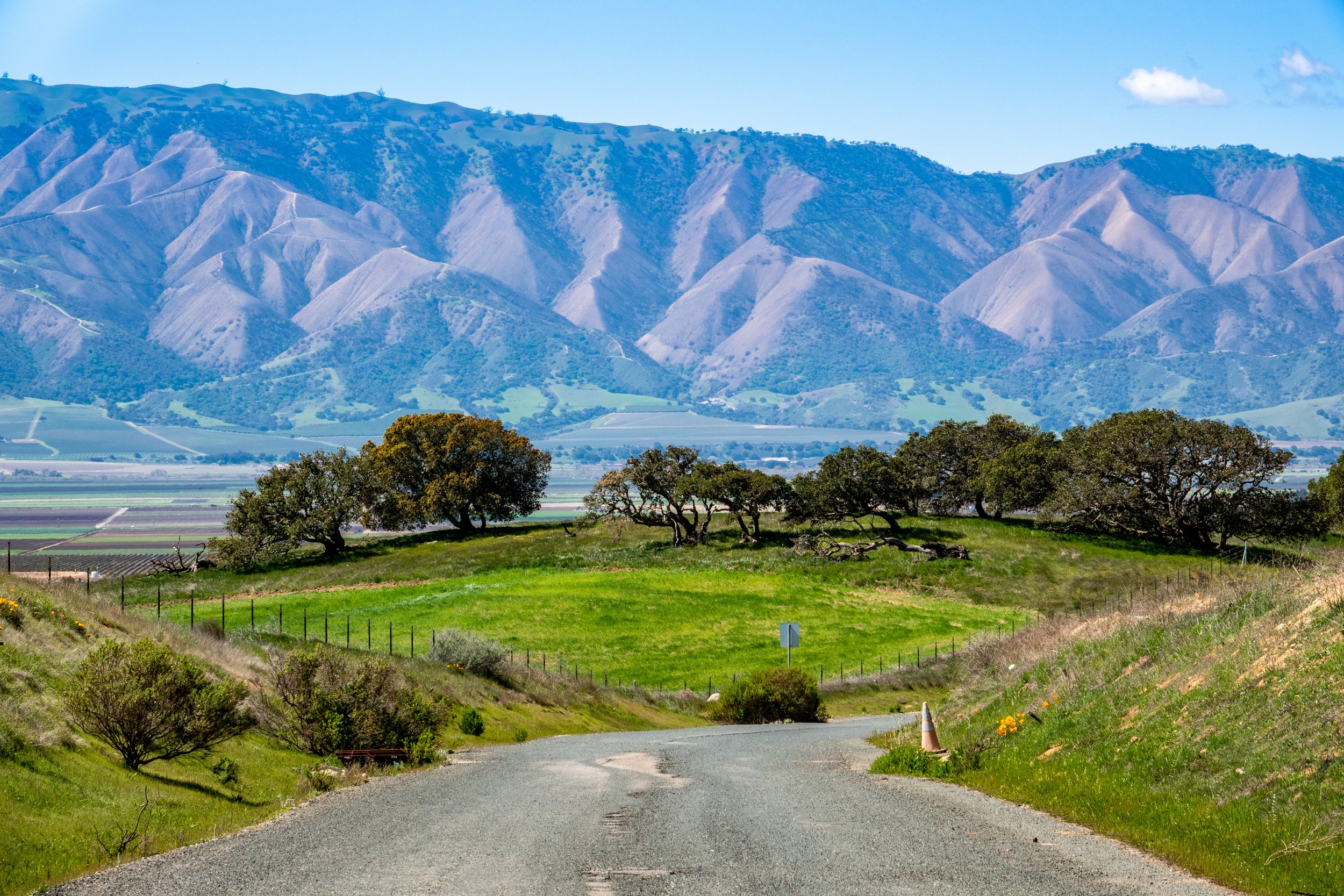
I began by researching my text and then sketching out cover options. Testing out color palettes started early on in the process and I settled on an ochre and burnt umber palette that evoke the earth and the dirt of the California valleys. I researched stock photos and found a Salinas Valley photo that could be manipulated to feel timeless. I utilized AI to wipe the image of modern fence posts and signs, leaving a raw landscape that I edited further using adjustments layers.
An important consideration was to make sure that the cover works for 21st century readers, who often look at books as small icons on a phone. I wanted to get rid of excess that gets in the way of catching a viewer’s eye, while retaining details that keep their gaze fixed. Having the ochre color frame the massive title in Uppercut Angle was a solution that felt correct for the myth-making of this book and its 21st century marketing needs.
I found a stock image illustration of a snake for the back cover to evoke the biblical themes of the book and used blending modes to make it recede into the burnt umber color. I created an illustration of an oak branch for the cover to break up the ochre color and provide another layer for the viewer’s eye to land on.
Book Cover
Covers of Previous Editions


Tools
iPad Pro
Procreate
Original Illustrations
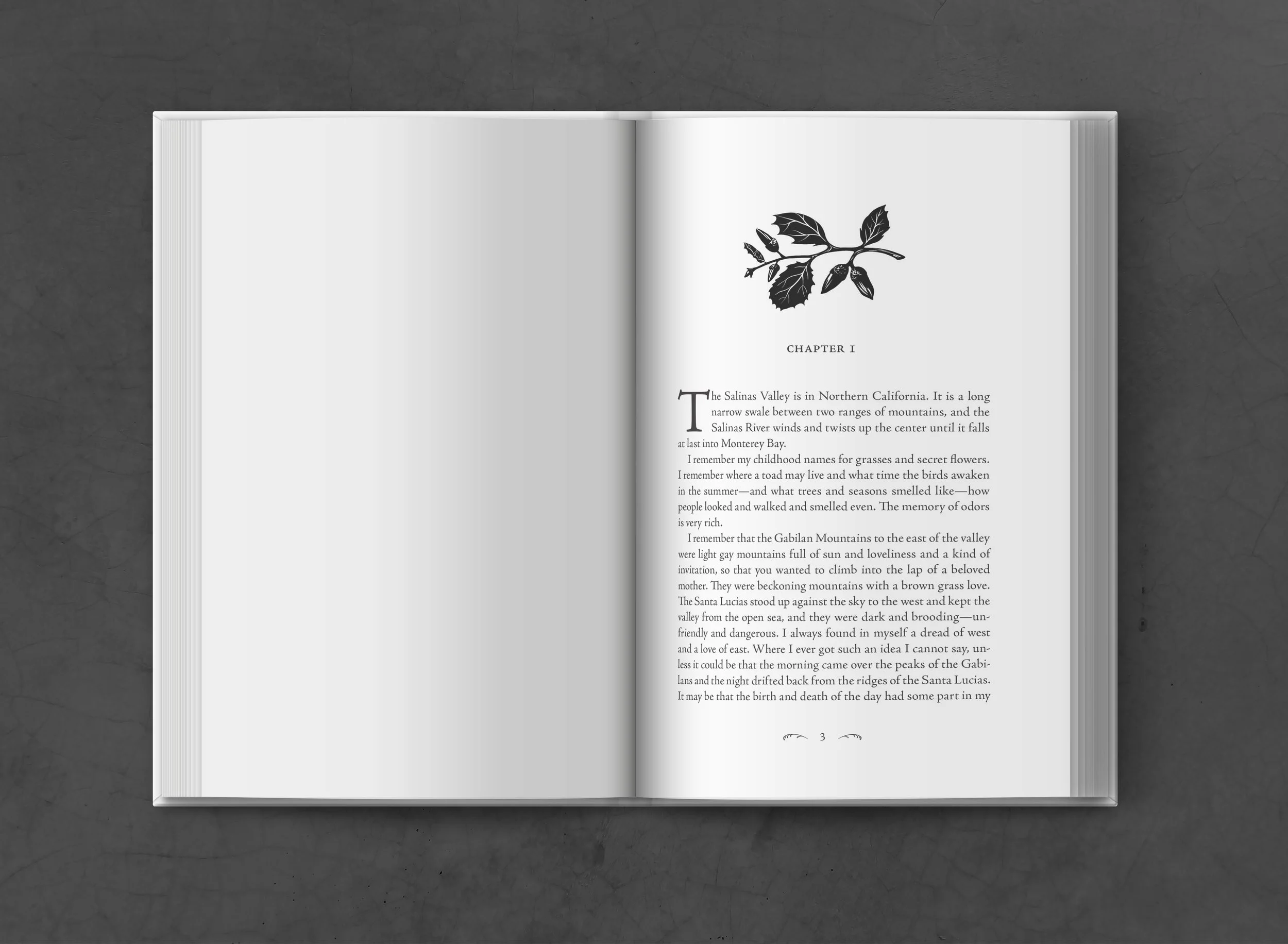
To evoke the biblical allegories and dark undercurrents of the text, I turned to woodcuts from medieval and Renaissance artists. I drew a Coastal Live Oak branch for the cover since it is an emblematic native tree to the California central valley. For the title page, I chose to illustrate an apple branch to evoke Adam and Eve; a story deeply entwined with the fate of the characters.
The roughly carved cuts into wood are mimicked by quick strokes with the Syrup Brush in Procreate. I made sure to follow a printmaking logic: the areas “cut out” would reveal the paper, and the remaining raised areas would get inked and printed on paper. The final effect is one of a stark and ancient myth; a visual language full of gravitas for the exterior and interior of our book.

Interior Spreads
I chose Adobe Jenson as the primary typeface for the text of East of Eden. This old-style serif typeface was the perfect marriage of readability and tradition for this Steinbeck classic. The headings in small caps and low pt size are restrained and allow for the illustrations to shine without fighting for hierarchy. The page numbers are centered and framed by glyphs in Geographica Script, giving them an almost agrarian aesthetic. The drop cap, 15 pt leading and justified alignment all serve the purpose of a comfortable reading experience for this large tome.
Packaging
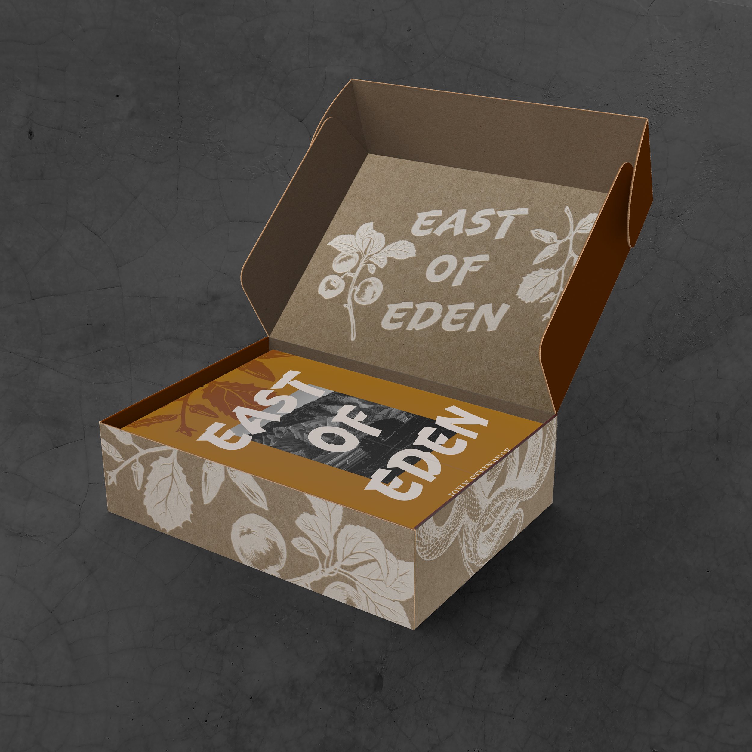
Admirers of Steinbeck works would have an interest in collecting new versions of his work. This limited edition East of Eden box is an asset in the marketing campaign for our book. The illustrations are reversed out into white and spread out across the naked cardboard box. It’s a marketing campaign with rustic and gritty visuals, interspersed with moments of decoration. The user sees the motifs of the book swirling on the box before opening it to reveal the new book inside.
InDesign Tutorial Video
Learn the steps to to creating a chapter opener, including considerations for Reflowable EPUB export so that layout is correct for an ereader.


Process and First Design
Creating the visual world of this book was a process of creating, revisiting and revising. The initial design was created in a Photoshop class and was a first step towards designing this world. Two men feature in strips that frame a brighter yellow. An oak tree sits between bands of brown on the back cover. There is tension but it falls short. The tree is too peaceful, the photos of the men distracting. The redesign of my initial cover gets rid of this fluff and delves further into the themes of the book. Designing a book is a process of continual revision until you can find the best visual solution to represent the text within.