Black Stream Boardworks
Visual Branding
Tools
Adobe Illustrator
Adobe Photoshop
Black Stream Boardworks is a shaper that was looking for a visual branding to help market their boards. The company needed direction for their tone and branding as they launch their business. Through discussions and meetings with the client, it was determined that the branding for the company needs to have energy, appeal to a wide audience and not take itself too seriously. There should be a bit of cheeky rebelliousness in there: an invitation to all to have fun in the water.
Logo Development
Black Stream had an old logo that relied on detail and fine lines which don't work well on a board. The logo is applied directly to a board and needs to be instantly recognizable from far away. The client had two design requests for their logo: A salamander in flames in reference to a family crest and a design that allows for easy color switches.
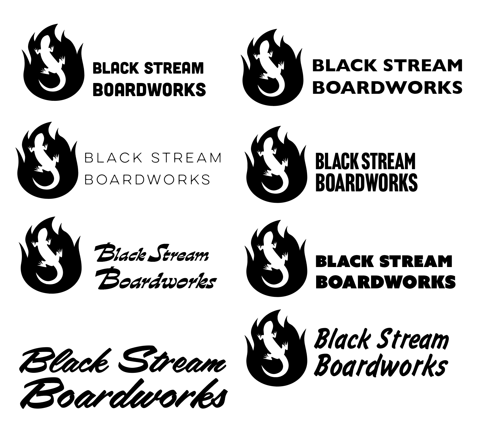
I sketched out many different versions and layouts and brought the strongest options into Illustrator. I found that the best solution was to turn the flames black and to have the Salamander be the negative space in the middle. The high contrast of the salamander against the flame creates a clear image that can be recognized from all the way down the beach. I chose Nove as the typeface for the company name. It provides the little bit of cheeky rebelliousness that captures the brand’s tone, while retaining easy readability from being a bold and blocky sans-serif.


Visual Style Guide: Logo and Color
Visual Style Guide: Typefaces and Graphics
Visual Style Guide
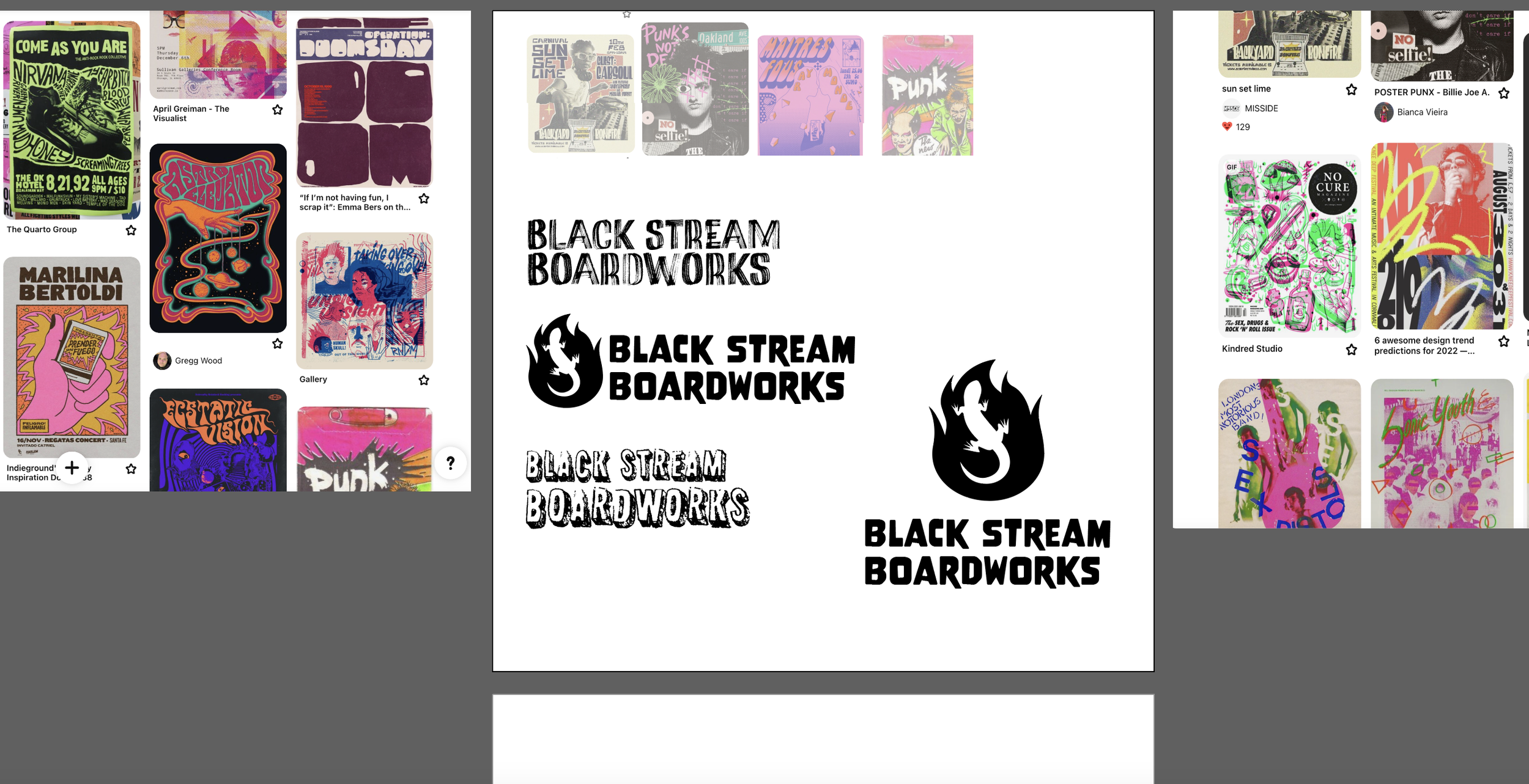
I met with the client frequently to discuss the tone and visuals of the brand. To capture the fun, the cheekiness and the energy of the brand, I turned to the visuals of 80s punk and 90s skater culture. Not only do these culture touchstones contain the energetic typeface styles and colors I was seeking, but the riotous break from the mainstream seriousness was also a point of inspiration.
The branding for Black Stream Boardworks is a balance between clean design and laid-back fun. The main brand colors of Dawn Patrol and Fog are a grounding for the visuals but we get accents of hot pink and lime green that maintain the playful tone throughout. The pairing of the sensible Roboto with the energy of Flood and Marker Aid fonts also strikes this same balance. The assets created for the brand are elegant but still harken to the hand-drawn, with the vectorized outlines of board shapes and the little squiggle wave lines that pop up throughout the branding. The final result is a surf brand that doesn’t take itself too seriously, but maintains a strong sense of craftsmanship in all its designs.
Website & Social Media
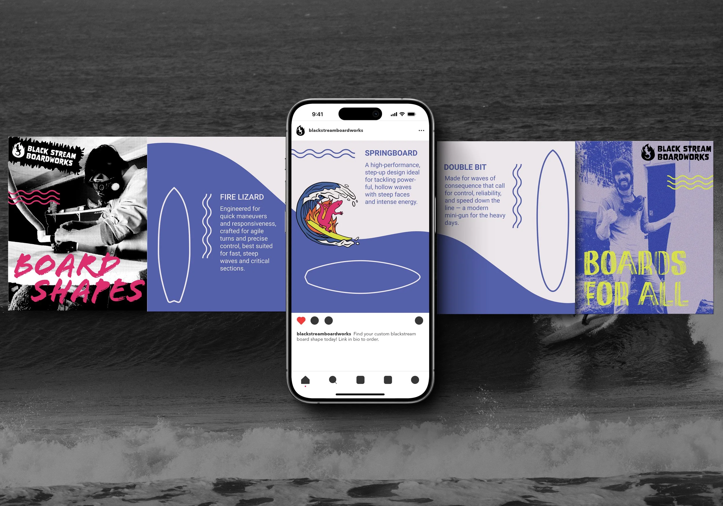
In designing the website and social media posts for Black Stream, I worked to balance energy with calm. The landing page embodies this approach: The loud and energetic tagline on the landing page is balanced by the restraint of the navigation bar and the sweeping hero image on a beach. Black and white photos are utilized to allow for the visual focus to be on the graphics and neon color. We have the repeated squiggle lines as a little playful motif that carries through all the visuals of the brand. The tone of the brand transmits through its web presence: we have fun! You belong here, so let’s create a custom board for your needs.


